|
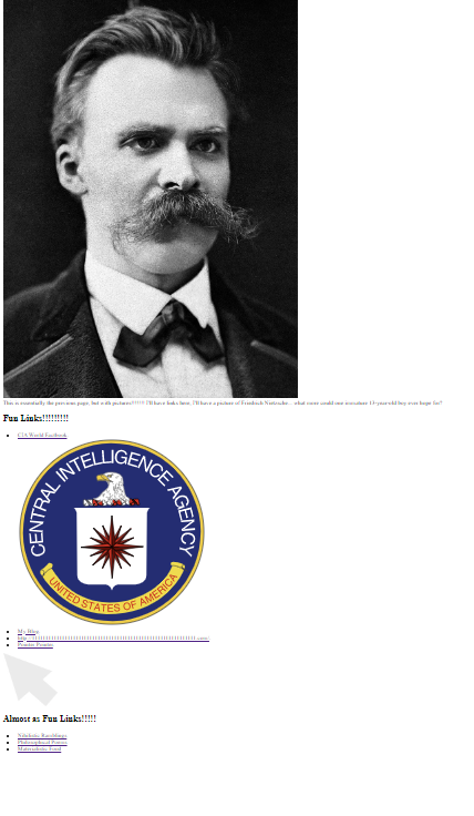
In this assignemnt, we had to use the template from the previous assignment, links, and add in 3 images using the <img=src>, <img=src alt=>, and <img=src alt title> tags. I used a picture of Friedrich Nietzsche, the CIA logo and a self-made curson that I am exceptionally proud of.
https://ramblingsofamadman.neocities.org/Images
0 Comments
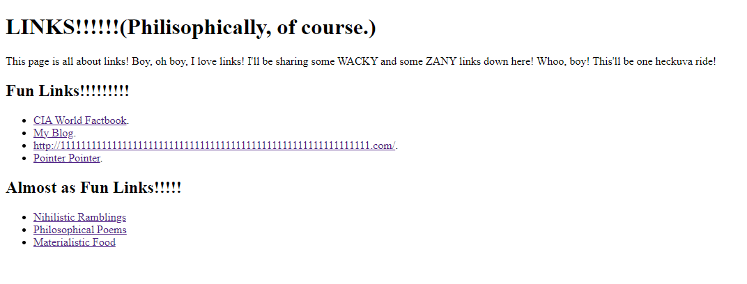
In this assignment, we learned how to write links in Neocities. I shared 7 links, to various different websites. Some of them were completely random, like Pointer Pointer, and some of them were oddly specific, like the CIA World Factbook, which I browse every 5 days. Either way, I put in 7 different links, per the assignment.
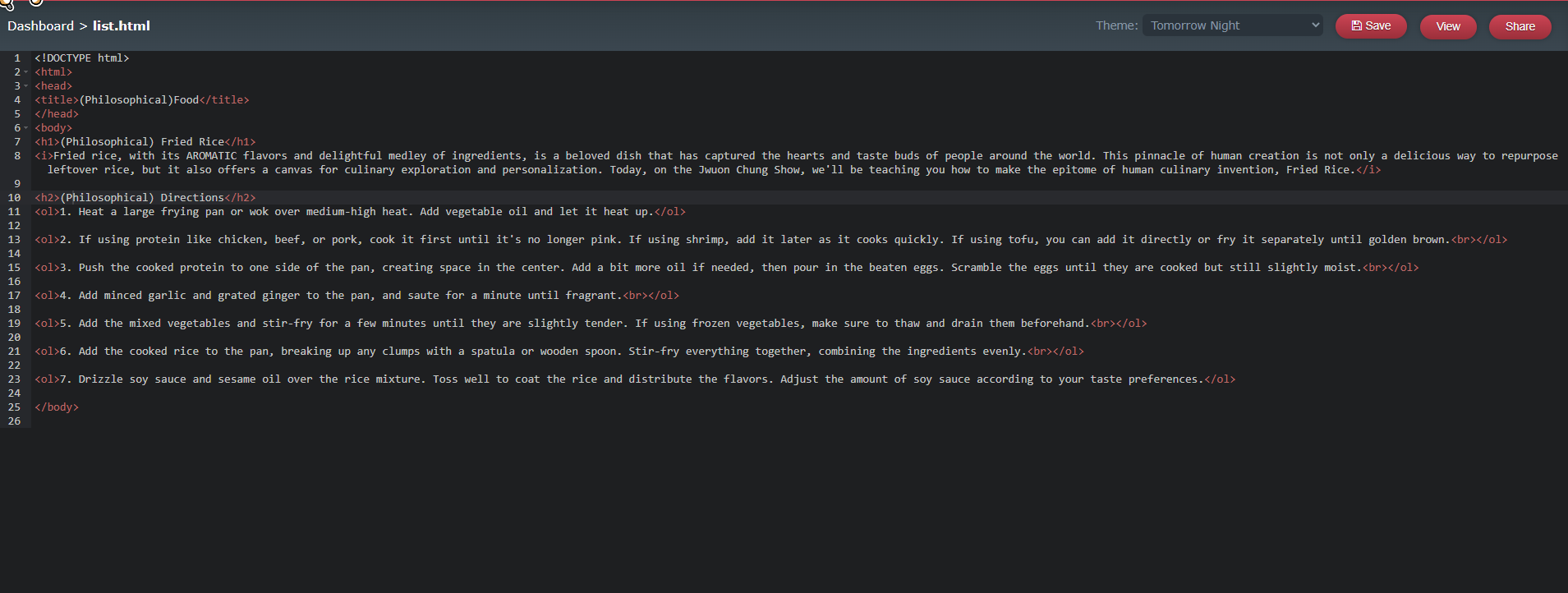
https://ramblingsofamadman.neocities.org/link In this assignment, we had to write directions pn how to make a specific food item. What I did was essentially research how to make fried rice, and then put my gathered knowledge into a new page, in my own words. I researched the best way to cook the rice, the best way to cook the meat, the best seasonings, etc, etc.
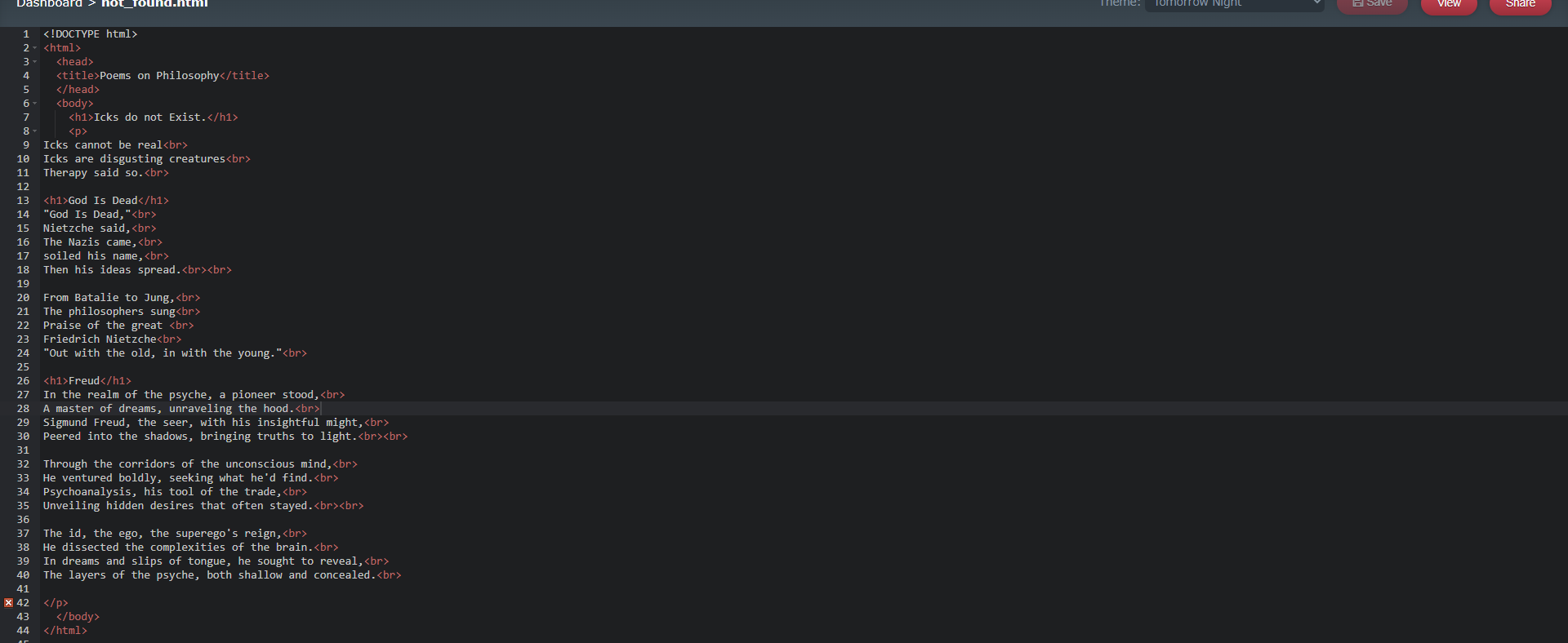
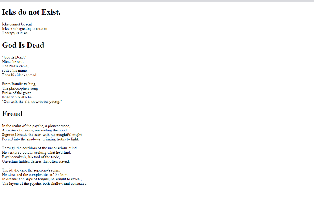
https://ramblingsofamadman.neocities.org/list So, for this assignment, I wrote three poems, being a limerick on Nihilism, a haiku on how Icks are despicable creatures and a free-verse poem on the philosophical genius of Sigmund Frued. I researched the first and third topic quite intensively, researching how they worked and what they did. The second paargraph was little more than a declaration of my hatred. It was a fun assignment, to say the least.
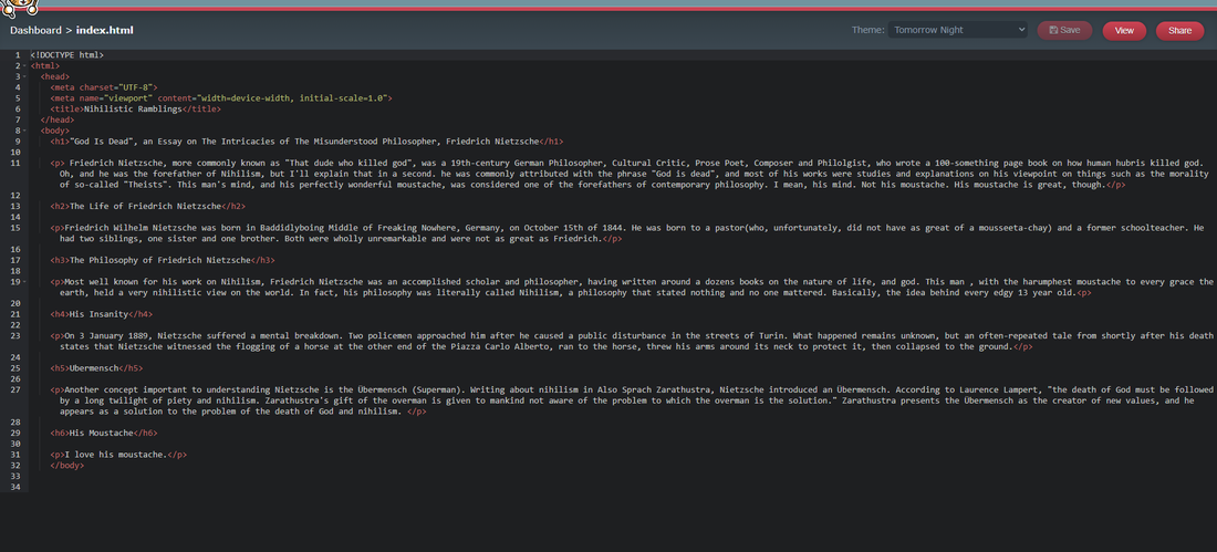
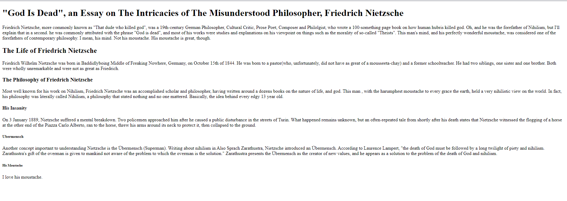
https://ramblingsofamadman.neocities.org/not_found I researched EXTENSIVELY into Friedrich Nietzsche for this one. It was... interesting, to say the least. I actually had some fun making this! Great experience. The coding was... easy, I guess. I didn't think much of the coding. I was mostly thinking of how great Nietzsche's moustache was.
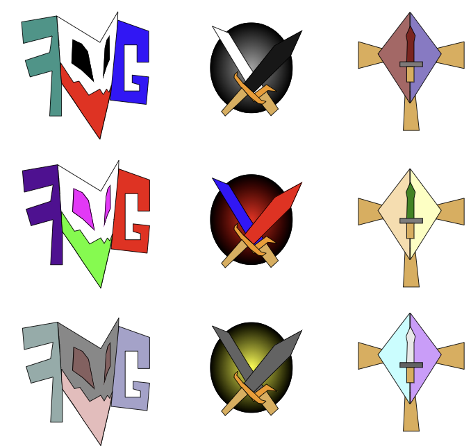
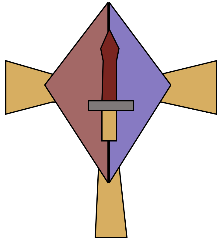
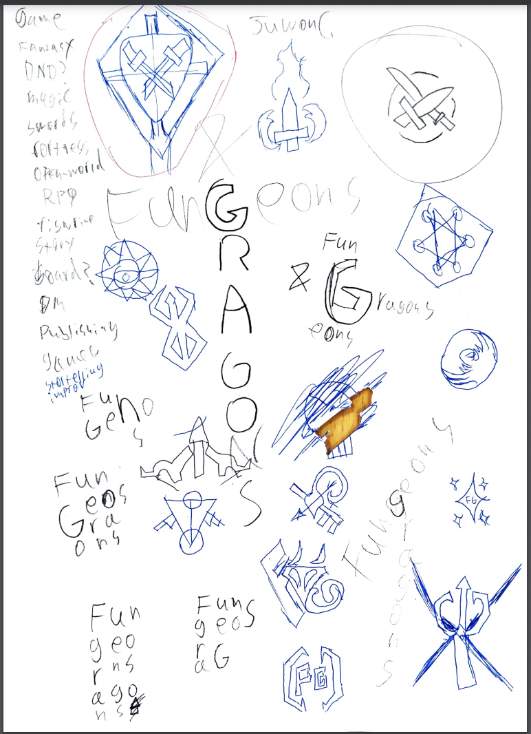
https://ramblingsofamadman.neocities.org/ In this portion of the process, we had to vectorize three of the logos from the previous assignment through CorelVector. After that, we needed to create three differently-colored variations for each of the three logos. While the coloring was mostly simple, the proess of vectorizing the logos was not. Having to make each and every bit of the logo with the pen tool was ridiculously hard. My favorite thing about this process had to be seeing the final product, While the process was, admittedly, painful, it felt good to see the product of my work. I learned how to turn drawings into digital logos. This company is called Fungeons and Gragons (Stylized as Fngns&Grgns), which is a fictional company based around tabletop RPGs like Dungeons and Dragons. The reason I chose this ficitonal company was I had recently used this name in a Dungeons and Dragons Research Assignement and thought it was a good fit for this assignment. The purpose of the brand is to give off the impression of 'Magic and Swords'-style fantasy, fitting with the tabletop RPG theming of the company. The logos that I made are all related to fantasy in some way. The first one shows some sort of ambiguous fantasy creature, with the letter F & G, the company's initials, stylized into it. The second logo is similar to the logos of many Mercenary Guilds in games such as Skyrim, with the crossed swords. The last logo has the aesthetic theming of a flag. The reason I like the third one the best is mostly because I really like the flag-like aesthetic/theme of it.
Fungeons and Gragns Inc., a publishing company that makes short books about Dunegons and Dragons. Out of the 15 logos, I just chose ones that seemed to fit it the best. I'm not sure which one I'll be using, though. All they symbolize is like the RPG and stroytelling bit of the company, the fantasy elements and such. I liked most of the just drawing ones, but I didn't really like the word ones. While it was kind of annoying, I think the process was overall easy enough.
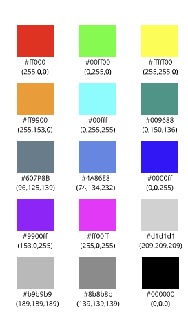
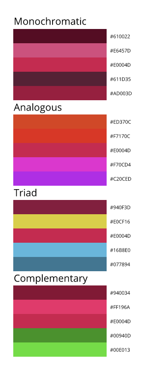
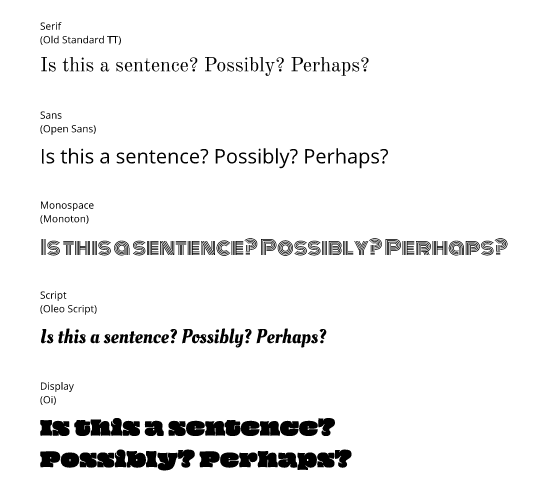
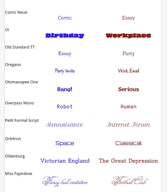
It was pretty enjoyable, I guess, not too frustrating, not too difficult. The hardest bit was actually thinking up the words. In the color names assignment, I made a grid layout of 15 different squares, all colored differently, with their RGB and Hex codes below them. We had to create an artwork with 15 different colors. In the color schemes assignment, we used Adobe Color to make 4 custom color schemes, monochromatic, analogous, complementary, and triadic. Each one consisted of five colors. I used rectangles to show the colors for both assignemnts. The main challenge is that it was really, really annoying. Constantly having to check the Hex and RGB values and then write them down, and then aligning everything was incredibly annoying. Color NamesColor SchemesTypography is the art of arranging letters or text in a way that makes the point clear to the viewer. Typography is important due to the fact that we use text in pretty much everything. If you cannot get your point across, then what's the point in writing messages? Good typography reinforces the meaning of the text. The quote "Each font has a personality and a purpose" means that each font has a time and place in which it should be used, to convey the message to the audience. We learned about 5 different types of fonts - Serif, Sans Serif, Monospaced, Script and Display fonts. Each one has a type of "mood" to it, Serif being formal and serious, oftentimes used in print, Sans Serif being more informal, commonly used on the internet. Monospaced means each letter takes up the same amount of space and is often used for coding, Script is like handwriting, often like cursive, and is good for logos and headlines, and Display is a good attention-getter, but doesn't work well in large blocks of text. Typeface ComparisonIn this assignment, we had to take one of each type of font - Serif, Sans Serif, Monospaced, Script and Display - and include sample text for each font. We needed to give the used font's name and type. Word PortraitsIn this assignment, we had to use 10 different fonts and write one wrod that matches the font's tone and one that does not. We needed to label each font used with their name. Essentially, what I did in this assignment is I colorcoded the 'matching' and the 'unmatching' words in blue and red, respectively.
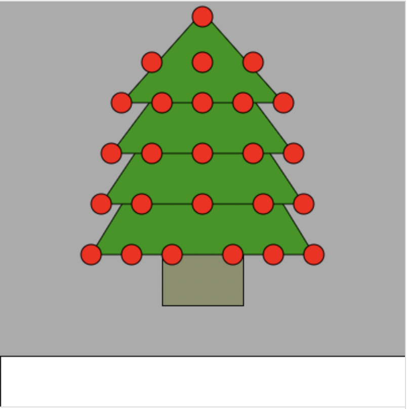
In this lesson, we learned how to draw using code. I made a christmas tree on a blanket of snow, because it's almost christmas and it felt appropriate. Over the past week, we learned how to draw shapes such as triangles, rectangles, ellipses and even custom shapes with javascript, a type of coding "language". we also learned how to seperate lines of code using a semicolon, and how to input points of a shape using code. This could have practical use in real life, whenever we need to code, as this lesson taught us all about learning to code. If I ever do need to code in the future, I can always think back to this lesson. Click here to try out the KhanAcademy tutorials yourself! background(171, 171, 171);
//base fill(138, 143, 107); rect(160,200,80,100); //leaves fill(28, 150, 0); triangle(90, 250, 200, 70, 310, 250); triangle(100, 200, 200, 50, 300, 200); triangle(110, 150, 200, 30, 290, 150); triangle(120, 100, 200, 10, 280, 100); //ornaments fill(255, 0, 0); ellipse(120, 100, 20, 20); ellipse(280, 100, 20, 20); ellipse(110, 150, 20, 20); ellipse(290, 150, 20, 20); ellipse(100, 200, 20, 20); ellipse(300, 200, 20, 20); ellipse(90, 250, 20, 20); ellipse(310, 250, 20, 20); ellipse(200, 15, 20, 20); ellipse(200, 100, 20, 20); ellipse(200, 150, 20, 20); ellipse(200, 200, 20, 20); ellipse(240, 100, 20, 20); ellipse(160, 100, 20, 20); ellipse(200, 60, 20, 20); ellipse(150, 60, 20, 20); ellipse(250, 60, 20, 20); ellipse(150, 150, 20, 20); ellipse(250, 150, 20, 20); ellipse(140, 200, 20, 20); ellipse(260, 200, 20, 20); ellipse(270, 250, 20, 20); ellipse(130, 250, 20, 20); ellipse(170, 250, 20, 20); ellipse(230, 250, 20, 20); //ground fill(255, 255, 255); rect(0, 350, 400, 100); |
Archives
June 2023
Categories |
