|
Fungeons and Gragns Inc., a publishing company that makes short books about Dunegons and Dragons. Out of the 15 logos, I just chose ones that seemed to fit it the best. I'm not sure which one I'll be using, though. All they symbolize is like the RPG and stroytelling bit of the company, the fantasy elements and such. I liked most of the just drawing ones, but I didn't really like the word ones. While it was kind of annoying, I think the process was overall easy enough. It was pretty enjoyable, I guess, not too frustrating, not too difficult. The hardest bit was actually thinking up the words. 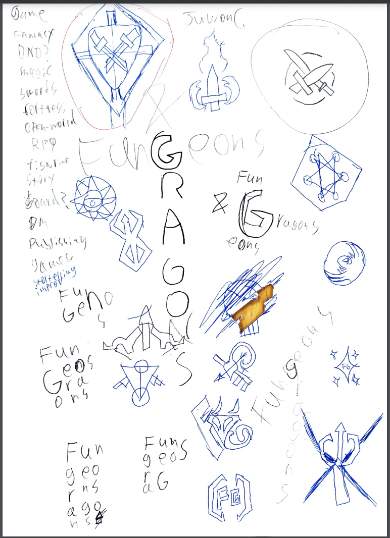
0 Comments
In the color names assignment, I made a grid layout of 15 different squares, all colored differently, with their RGB and Hex codes below them. We had to create an artwork with 15 different colors. In the color schemes assignment, we used Adobe Color to make 4 custom color schemes, monochromatic, analogous, complementary, and triadic. Each one consisted of five colors. I used rectangles to show the colors for both assignemnts. The main challenge is that it was really, really annoying. Constantly having to check the Hex and RGB values and then write them down, and then aligning everything was incredibly annoying. Color Names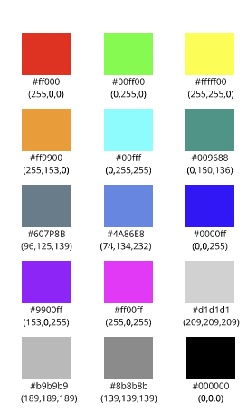 Color Schemes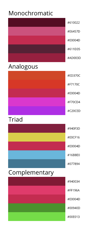 Typography is the art of arranging letters or text in a way that makes the point clear to the viewer. Typography is important due to the fact that we use text in pretty much everything. If you cannot get your point across, then what's the point in writing messages? Good typography reinforces the meaning of the text. The quote "Each font has a personality and a purpose" means that each font has a time and place in which it should be used, to convey the message to the audience. We learned about 5 different types of fonts - Serif, Sans Serif, Monospaced, Script and Display fonts. Each one has a type of "mood" to it, Serif being formal and serious, oftentimes used in print, Sans Serif being more informal, commonly used on the internet. Monospaced means each letter takes up the same amount of space and is often used for coding, Script is like handwriting, often like cursive, and is good for logos and headlines, and Display is a good attention-getter, but doesn't work well in large blocks of text. Typeface ComparisonIn this assignment, we had to take one of each type of font - Serif, Sans Serif, Monospaced, Script and Display - and include sample text for each font. We needed to give the used font's name and type. 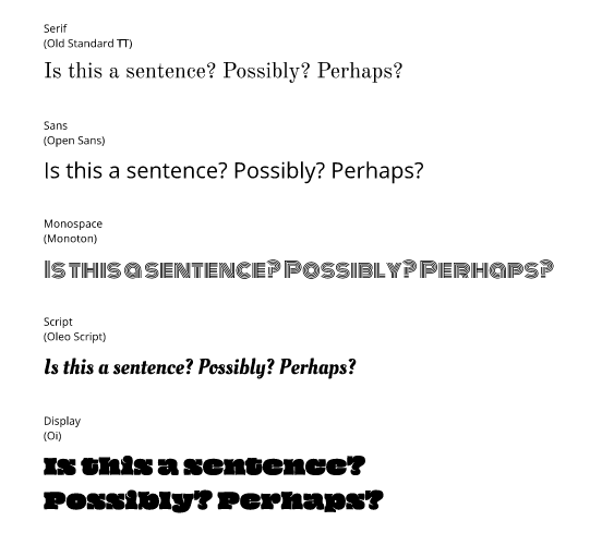 Word PortraitsIn this assignment, we had to use 10 different fonts and write one wrod that matches the font's tone and one that does not. We needed to label each font used with their name. Essentially, what I did in this assignment is I colorcoded the 'matching' and the 'unmatching' words in blue and red, respectively. 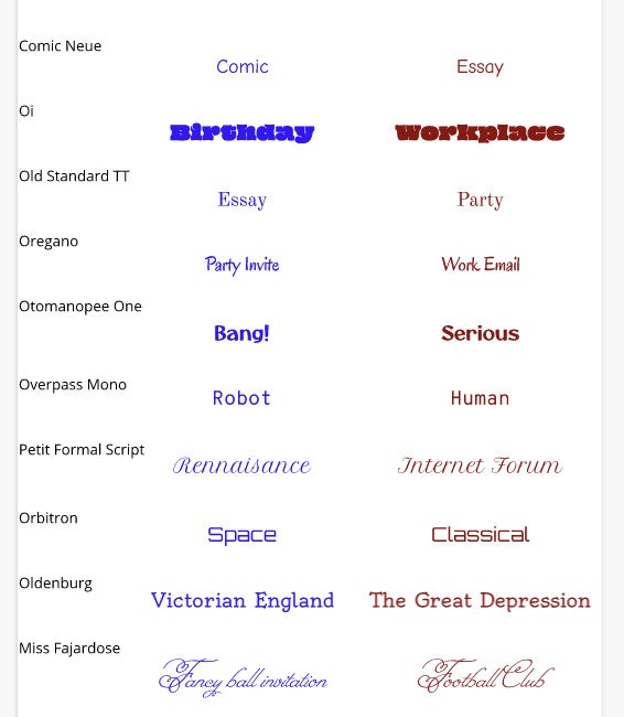 |
