|
In the color names assignment, I made a grid layout of 15 different squares, all colored differently, with their RGB and Hex codes below them. We had to create an artwork with 15 different colors. In the color schemes assignment, we used Adobe Color to make 4 custom color schemes, monochromatic, analogous, complementary, and triadic. Each one consisted of five colors. I used rectangles to show the colors for both assignemnts. The main challenge is that it was really, really annoying. Constantly having to check the Hex and RGB values and then write them down, and then aligning everything was incredibly annoying. Color Names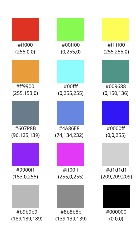 Color Schemes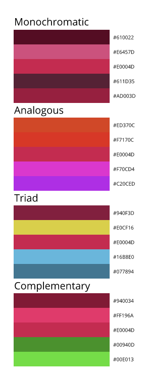
0 Comments
Typography is the art of arranging letters or text in a way that makes the point clear to the viewer. Typography is important due to the fact that we use text in pretty much everything. If you cannot get your point across, then what's the point in writing messages? Good typography reinforces the meaning of the text. The quote "Each font has a personality and a purpose" means that each font has a time and place in which it should be used, to convey the message to the audience. We learned about 5 different types of fonts - Serif, Sans Serif, Monospaced, Script and Display fonts. Each one has a type of "mood" to it, Serif being formal and serious, oftentimes used in print, Sans Serif being more informal, commonly used on the internet. Monospaced means each letter takes up the same amount of space and is often used for coding, Script is like handwriting, often like cursive, and is good for logos and headlines, and Display is a good attention-getter, but doesn't work well in large blocks of text. Typeface ComparisonIn this assignment, we had to take one of each type of font - Serif, Sans Serif, Monospaced, Script and Display - and include sample text for each font. We needed to give the used font's name and type. 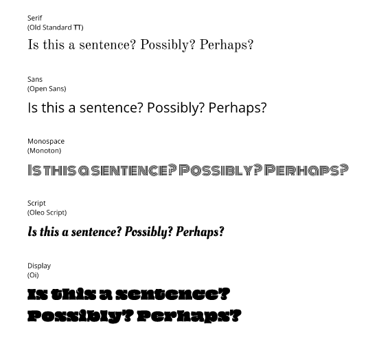 Word PortraitsIn this assignment, we had to use 10 different fonts and write one wrod that matches the font's tone and one that does not. We needed to label each font used with their name. Essentially, what I did in this assignment is I colorcoded the 'matching' and the 'unmatching' words in blue and red, respectively. 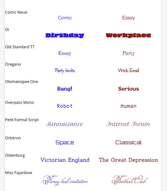 In this summative, we learned how to use the pen tool for a variety of exercises. The pen tool is a tool used to create more complex shapes than any of the basic choices by using straight and curved lines. In the first assignment, we were assigned to use the pen tool to trace various Superhero symbols. We also learned how to twist and contort the pen lines. In the second assignment, we learned how to manipulate a line's anchor points and how to crop and 'mask' images. For my final illustration, I did two images using the Joker's face. In the first image(on the left), I cut and placed a picture of Heath Ledger's Joker(The Dark Knight Returns) on top of an image of Snufkin(Moomin Valley). In the second image(on the right), I used an image of Bruce Wayne(The Dark Knight Trilogy) as the base and photoshopped Joaquin Phoenix's Joker(The Joker 2019) on top of his face. I had a lot of fun making these, but there was one main challenge; I couldn't think of any combinations of characters that would be interesting. To over come this challenge, I just thought of a few characters that I enjoyed, and just slapped them together.. 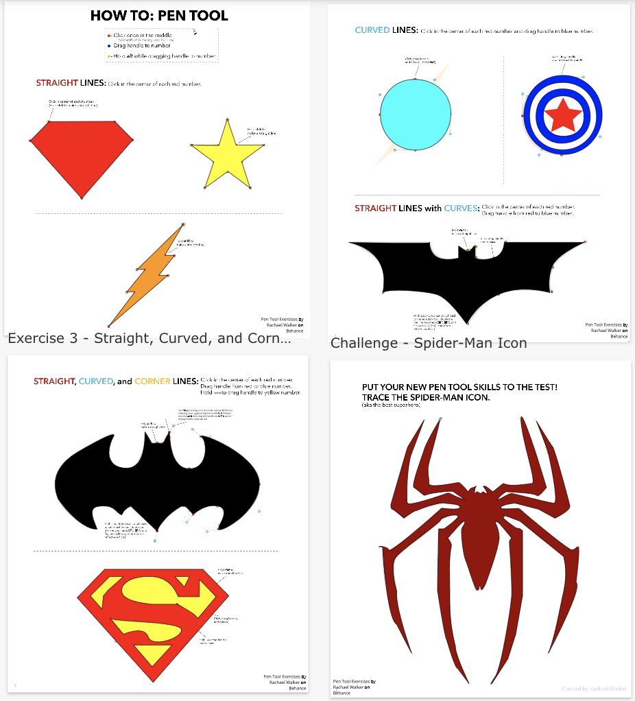 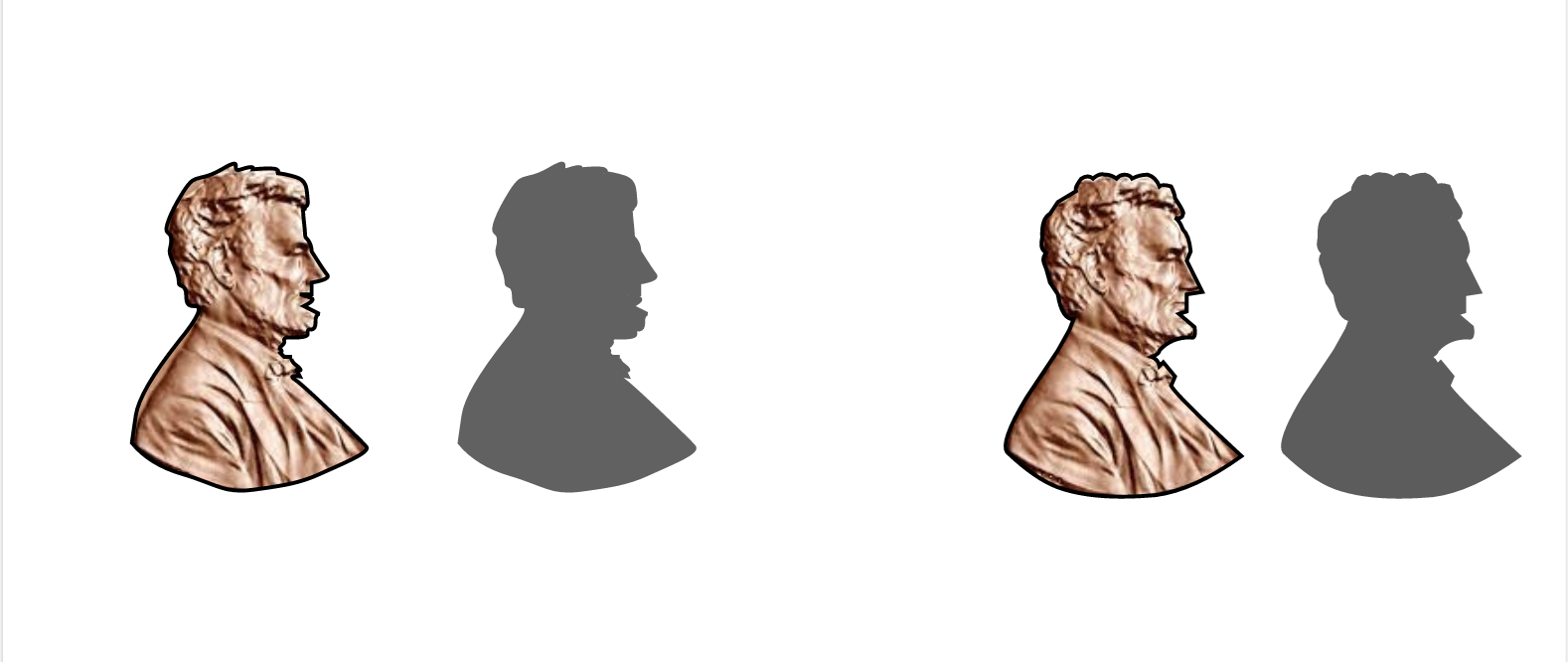 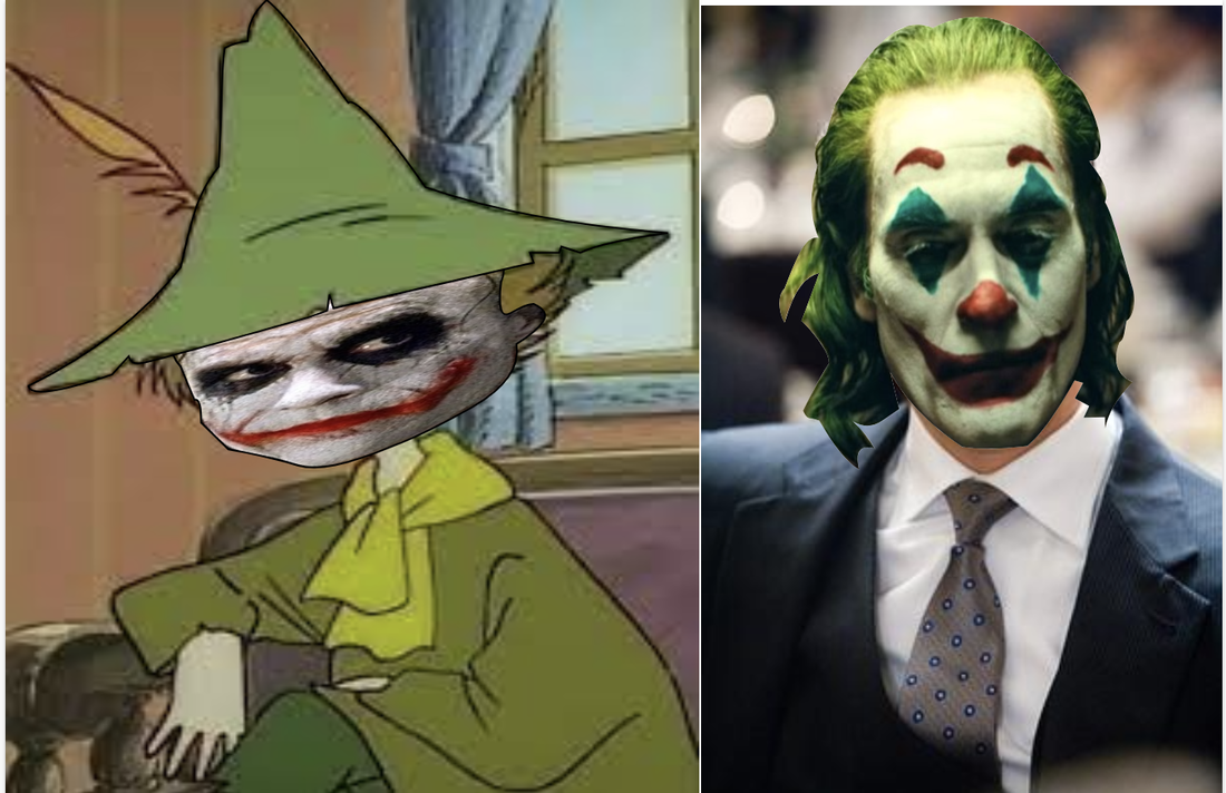 This scene is important to me because it is something I do on a regular basis. What inspired me to draw a golf course was, of course, me playing golf. I play golf regulairly, about twice or thrice a week. Golf is one of the main things I do each week, going out to practice on the weekends and after school on weekdays. That's the main reason I wanted to draw a sample golf hole. At the top is the putting ground, surrounded by two bunkers. Below it are the rough and the fairway. Surrounding the hole is a small lake. The squares at the bottom are the tee boxes. 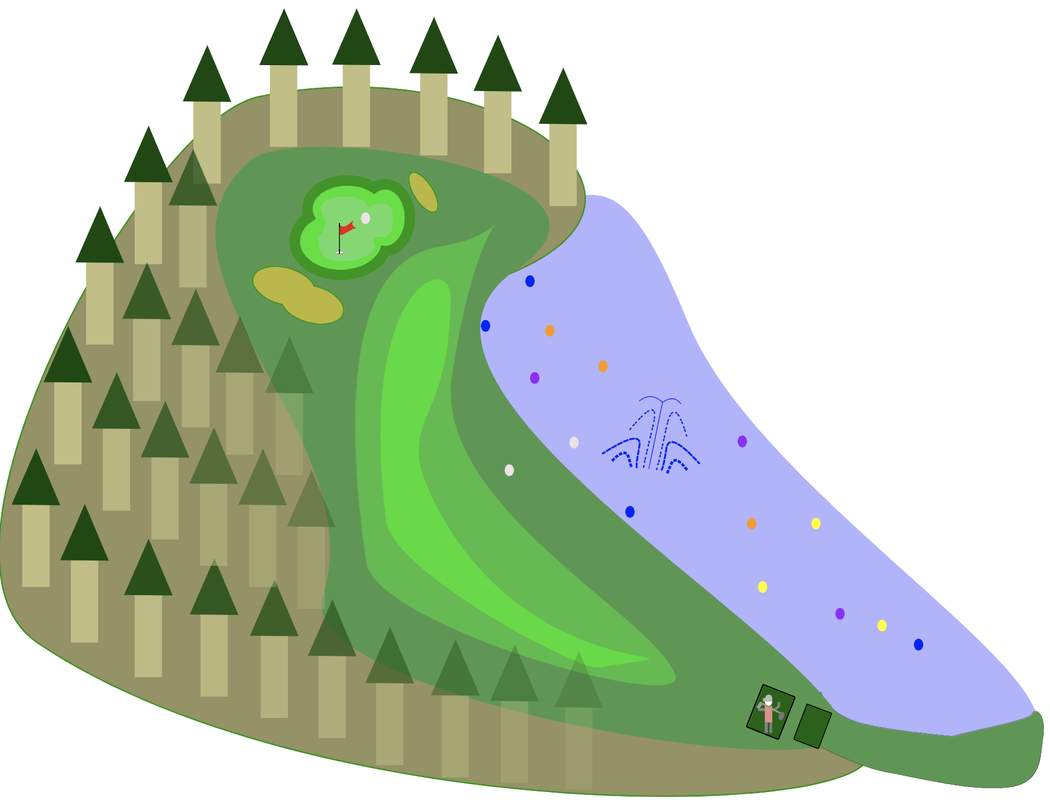 In this lesson, we learned how to use, customize and change shapes in CorelVector. I found it interesting how many ways you can customize shapes, with there being options for rounding corners, increasing the number of points on the object and etc. 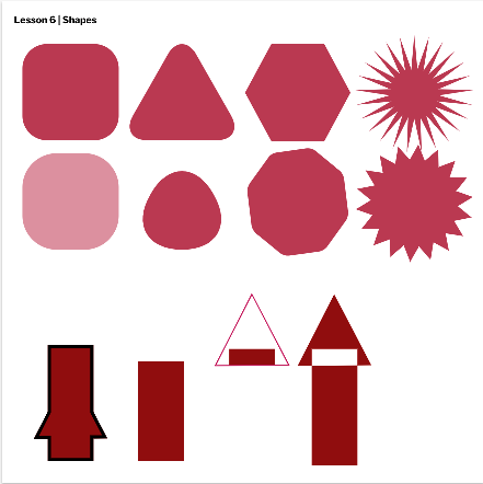 What we learned in this lesson was how to use layers, how to group and how to align. We learned a few more keyboard shortcuts for grouping and alignment. It was interesting to see how well the alignments and groupings worked. 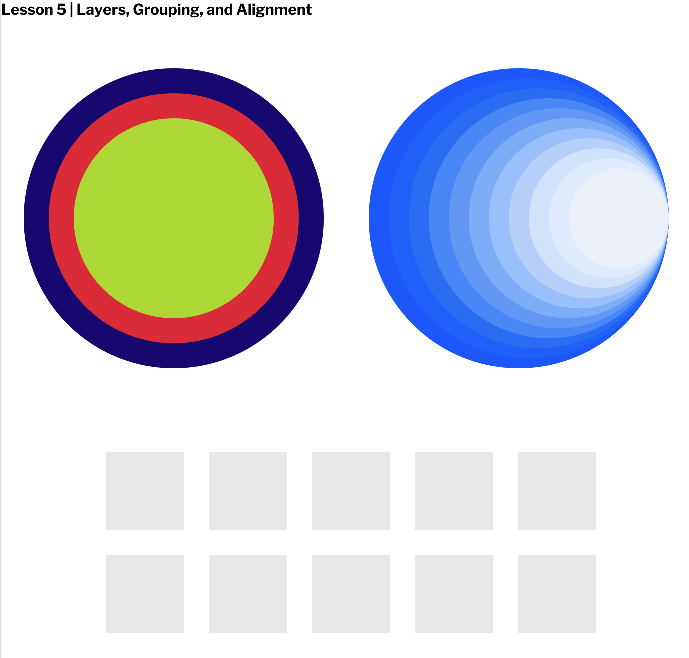 In this lesson, we learned how to use fills and borders. It was interesting to test how far we could go with the border options. 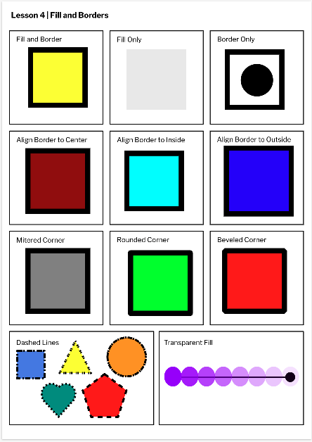 In this lesson, we learned how to use selection tools. We also learned keyboard shortcus to the pointer and subselector tools. We also learned how to upload projects from our computers rather than cloud. It was interesting to see the amount of tools CorelVector has.  In this lesson, we learned how to use pages and formatting. We also learned how to change fonts and colors. We learned how to put all the pages into one large page. I found it interesting how many ways there are to format. 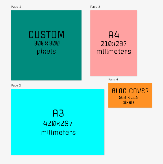 I do not have much experience with graphic design. I know graphic design is widely used to appeal to a certain audience, and it can be applied to many different areas, such as advertising a product, explaining a point, or making something visually appealing. The most experience I've had with graphic design is last year when I would use Canva and Google Slides to make posters for various classes.
|
